
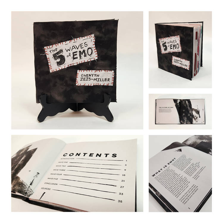
The 5 Waves of Emo Chapbook
"The 5 Waves of Emo" is a book detailing the history of the emo music genre. It also highlights bands from each era with interactive foldouts. As one of my favorite genres of music, I wanted to make sure I was properly paying tribute to the bands that have defined the past five decades.


The Challenge
When tasked with creating a book representing the five eras of emo music, I was faced with a huge question: how do I represent each unique era accurately while also giving the book a unified design and feel?
I decided to tackle this challenge by giving myself a few simple rules. First, I would use a unified texture system throughout the design. Second, my typography would remain consistent within the book. Third, my image presentation would be a unified style throughout the book.
Unifying a System
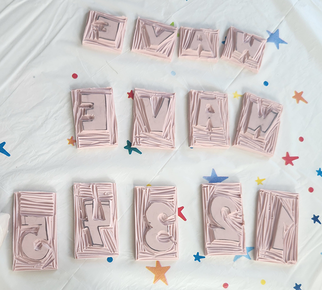
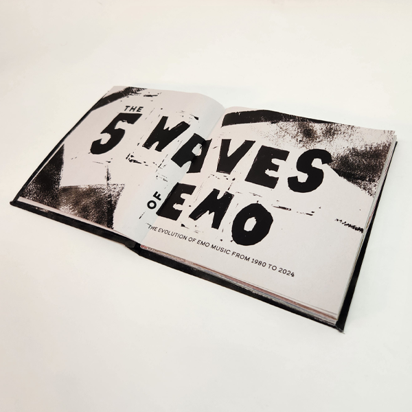
DIY methods are at the core of emo culture, so it only felt right to make it the core of my book design. To achieve this feel, I decided a hand-done ink texture would be a good basis for the entire book. Using a roller and stamps, I hand carved and printed letters and blocks that I then scanned and utilized for the book.
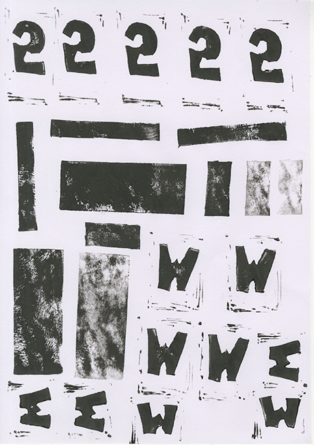
One of my favorite things about using hands-on methods is allowing the mistake-prone process of creating to influence my future design choices. For this project, the messy nature of ink printing inspired me to choose my typography to match. My headings are sans-serif, bold, and have small flaws within them to match the bold stamped characters and textured backgrounds.
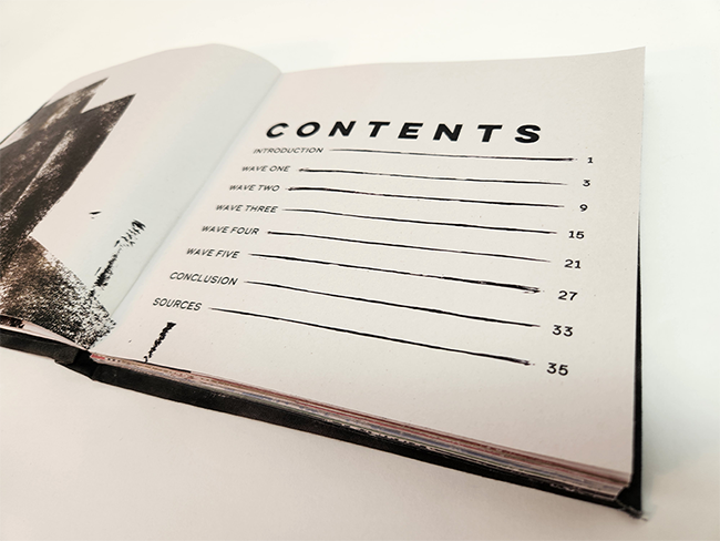
Defining the Sections
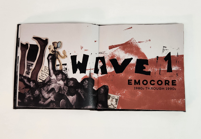
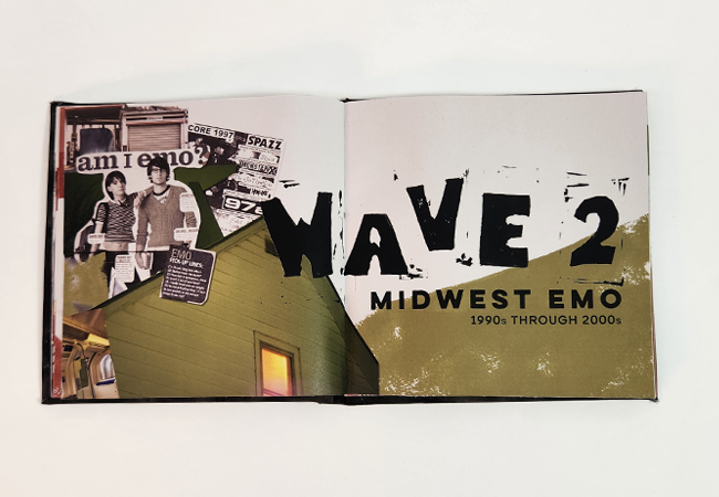
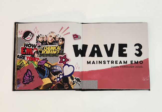
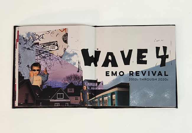
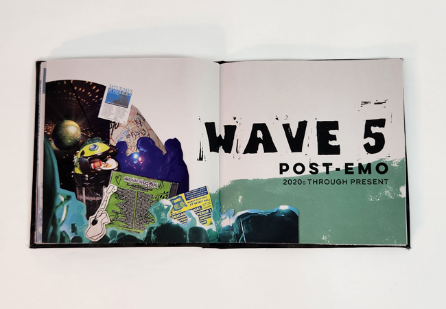
With black as my main color, I needed to find a way to distinguish each section. Thus, I worked on developing a cohesive but unique color palette. This began with research. Through visits to the library, observation of music posters from each era, and online forum scrolling, I collected a unique set of images for each wave of emo. After this, I observed common color appearances within each era, and chose one over arching color to represent them. The rolled ink textures that remained black on the introductory pages were changed to this color for each section. I then supplemented my image collection with images that I had personally taken that I felt matched each era, and made a similar collage style introduction page for each wave.
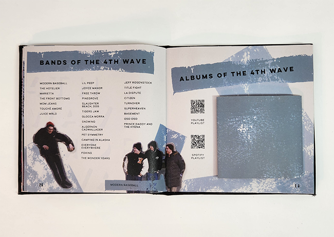
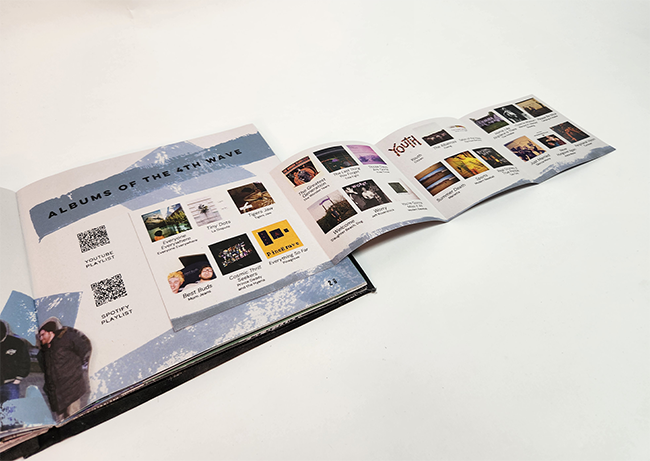
Adding interactivity
When a design is made online, there is only so much that can be interacted with. Print in its tactile form gives way to much more fun elements to touch and experience. When I decided to create a section of this book that shares album covers from each wave of emo music, I knew it was the perfect opportunity to add interactivity. Each section has a foldout that allows the viewer to explore the wave more in depth. If I had displayed the information in a more traditional way, it would have added pages of monotonous information. This method is a bit more fun and space saving!
The Final Product
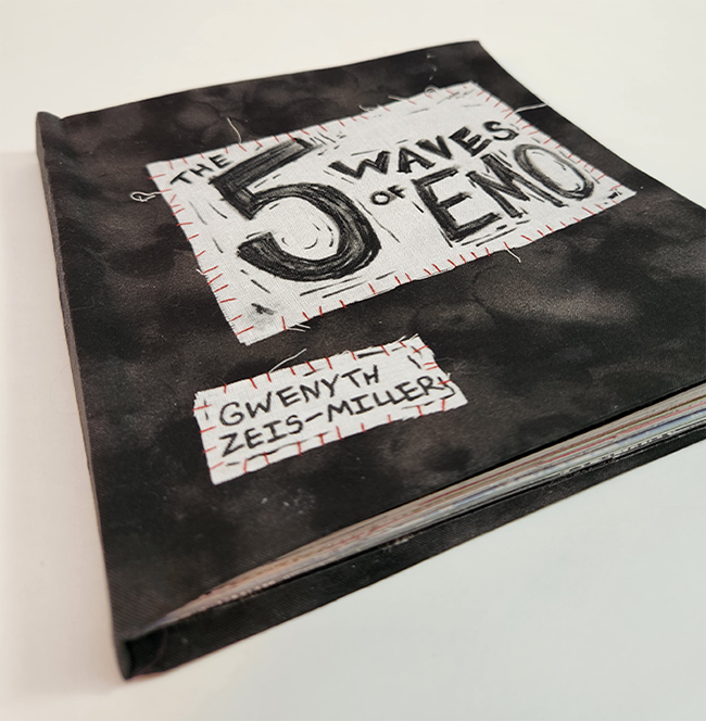
The most important aspect of a printed work is how it exists in the world. Print is meant to be interacted with. Everything from the look to the feeling of a final printed product in your hand matters. When finishing this book, I decided to make the cover out of fabric and to hand make the title as a patch that I then sewed on. As I said before, much of emo culture is based around DIY ethos. A common clothing trend is to wear jackets, vests, and pants decorated with patches. Having a patch sewn onto the cover with real stitching that the viewer can feel adds an element of authenticity to the final product. Overall, print is an entire package experience, and the cover should be taken just as seriously as the contents of the work.
Year: 2024
Art Director: Derek Wituki
Materials: Newsprint, Fabric, Embroidery Floss
Institution: Pennsylvania Western Edinboro