

Black Bear Bar & Bops
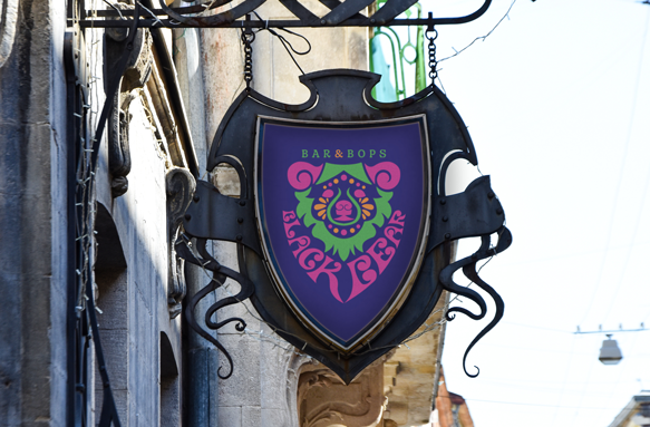
Black Bear Bar and Bops is a unique bar concept combining three things: yummy drinks, great music, and cool black light art. This cool space requires contemporary branding that is sleek but fun, and loud but professional.


Thinking Stage
While not all ideas start with a mind map, this one did. A black light bar could invoke many different feelings, and I wanted to hone in on the correct vibe. I didn’t want the branding to invoke a dark and dangerous feeling. I wanted a kind, inviting atmosphere while still feeling cool and contemporary. The thought of a dark space made me think about a bear den, and bears made me think about mother bears protecting their cubs. Thus, this thought process led me to decide to begin thumbnail explorations in the direction of bears. I originally considered the name “The Blacklight District.” Then I shifted to focus on a bear name as the idea evolved.
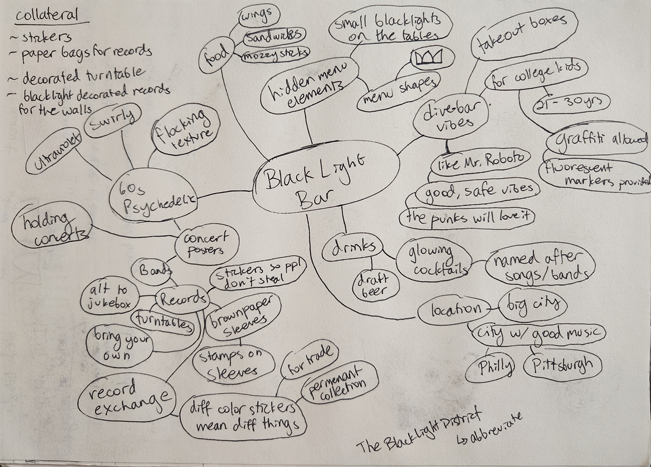
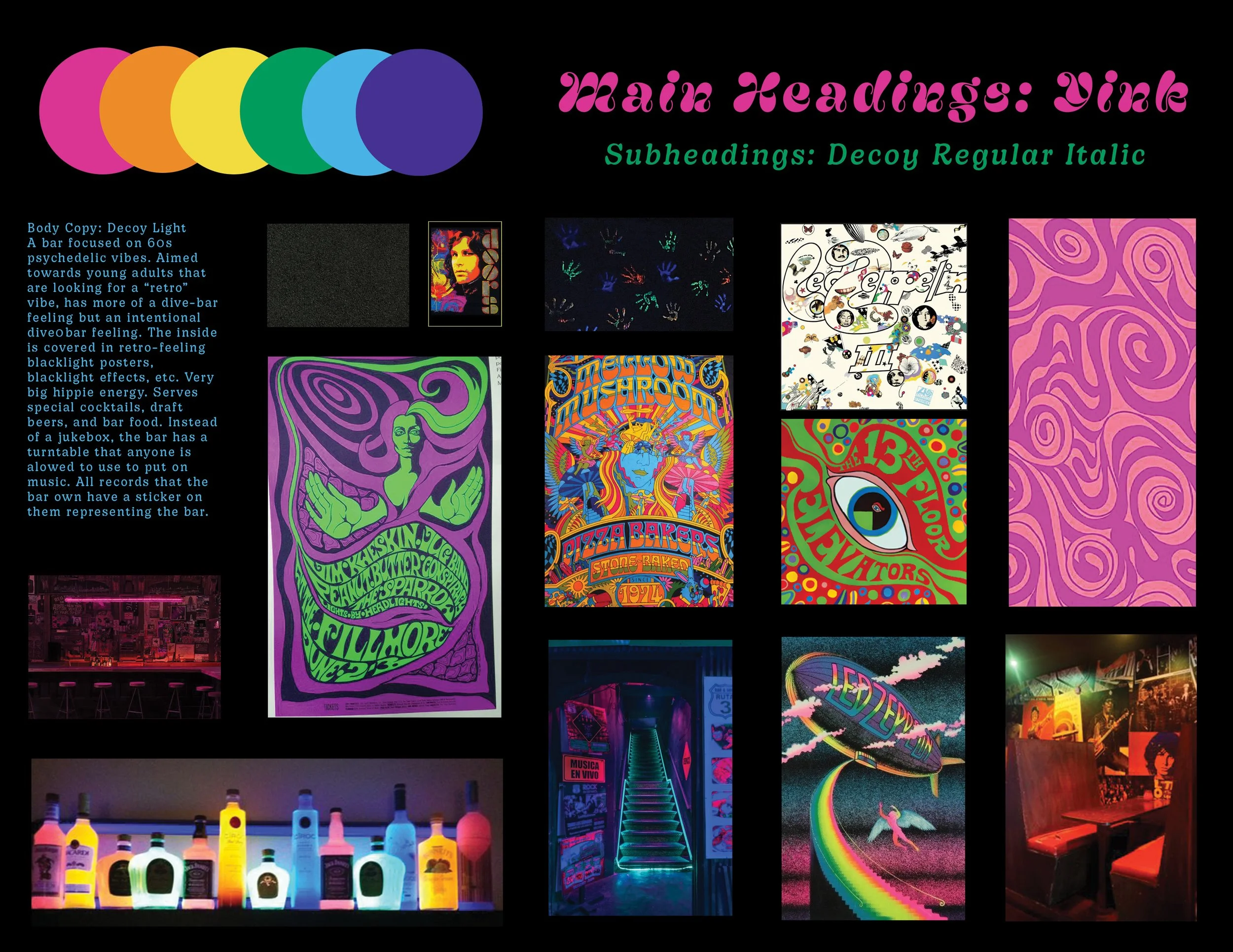
My ideation explored psychedelic elements due to the blacklight aesthetic. I began searching for inspiration and drafted an initial mood board. In the 70s, the psychedelic design movement often used a variety of free-flowing lines, curves, and wacky shapes. Floral elements were often present as well, and art nouveau was a direct influence on the style, too. As I started my thumbnails, I began to incorporate swirls and floral elements into my ideation in order to pay homage to these styles.
Exploring Stage
After sketching my thumbnails, I decided to further explore 4, 8, and 22. I created digital roughs from these three designs, deciding to hand letter the type within 8 due to being unable to find a typeface that was an appropriate match for the aesthetic I was aiming to achieve. While I liked 4’s design, I ultimately decided to move forward with 22.
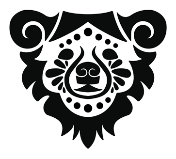
Thumbnail 22
Thumbnail 4
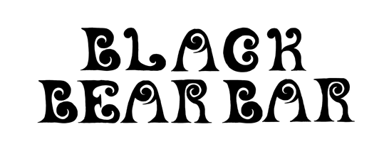
Thumbnail 8
22 proved to be a challenge. At first I considered combining it with 8. However, the type competed with the design too much. I quickly realized that working with type and this logo design would be a challenge. I had to craft type that would work as a piece of art itself and live alongside the logomark in harmony. This is where I decided to pursue hand lettering. Overall, I believe this was the correct decision. Much psychedelic art from the 70s was hand done, as technology was not a prevalent tool then. To properly pay homage to this aspect of design history, it only made sense to borrow methods from the masters!
Thumbnail 8 and 22 combo
Beginning to handletter
The challenge of typography
With a more dominant hand-lettered display font, I needed to find a secondary typeface that would be unobtrusive while still matching the feeling I was attempting to achieve. I used thumbnail 8 as a jumping off point for exploring these secondary typefaces. Decoy became the typeface that matched the best, and I began to explore its arrangement with logo 22.
Various explorations of type and type placements
Incorporating hand lettering into this project proved to be a challenge. However, by utilizing all of the elements from my previous brainstorming steps, I was able to craft a balanced logo that incorporated the fun blacklight psychedelic feeling that I was aiming to achieve.
Executing Stage
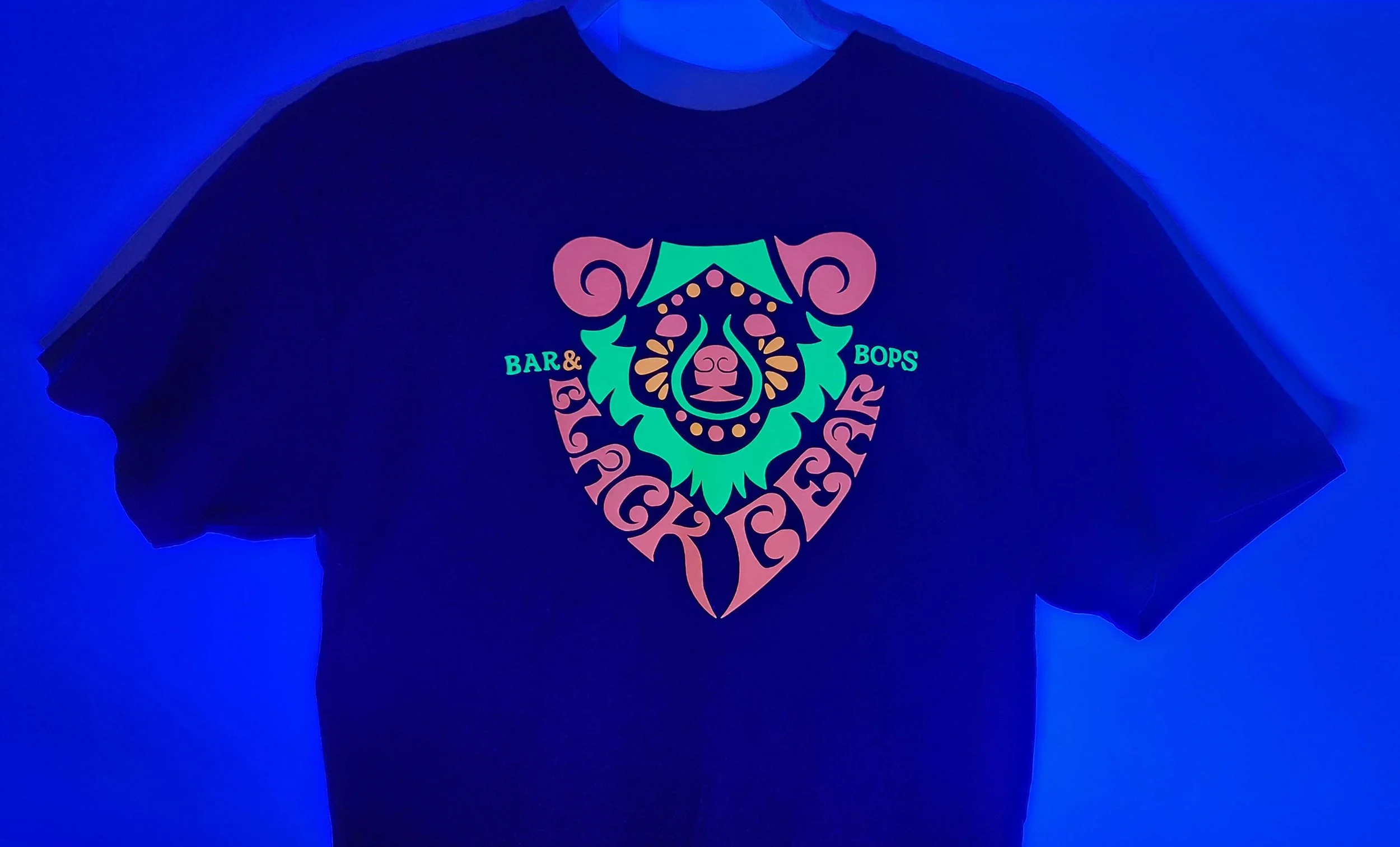
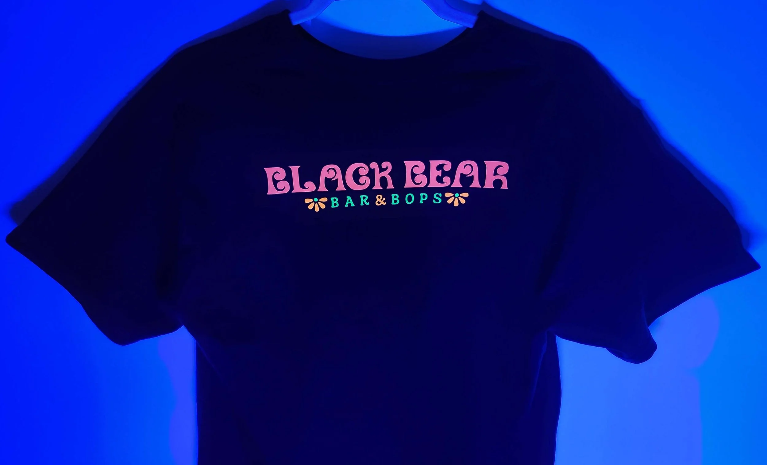
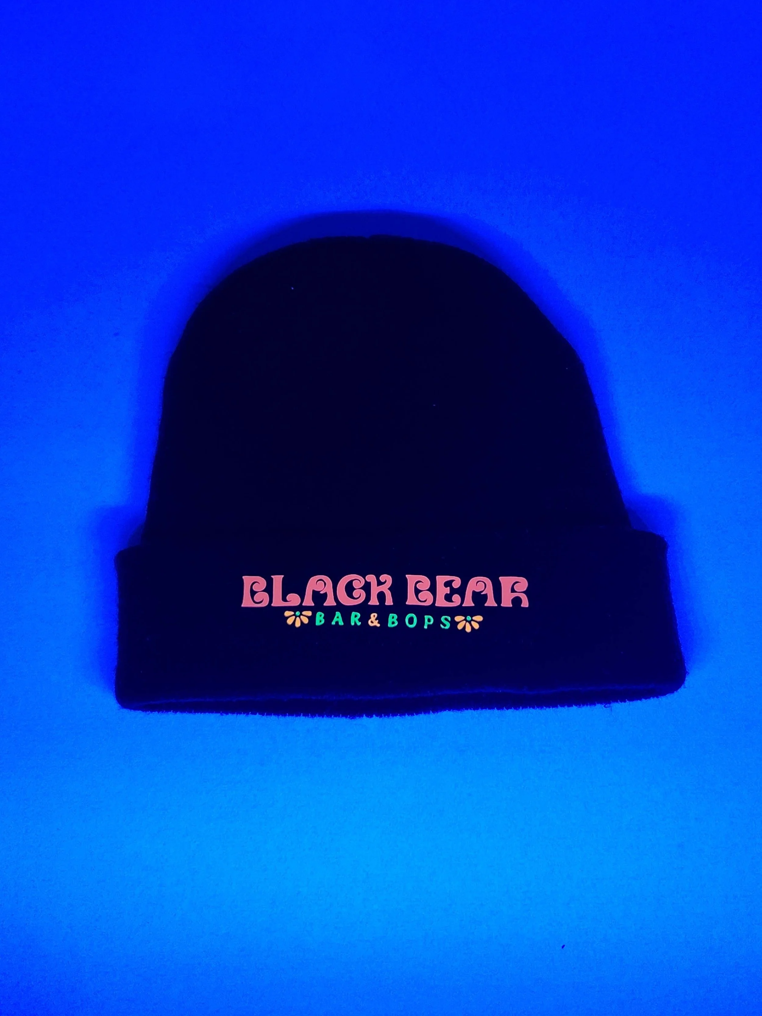
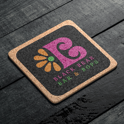
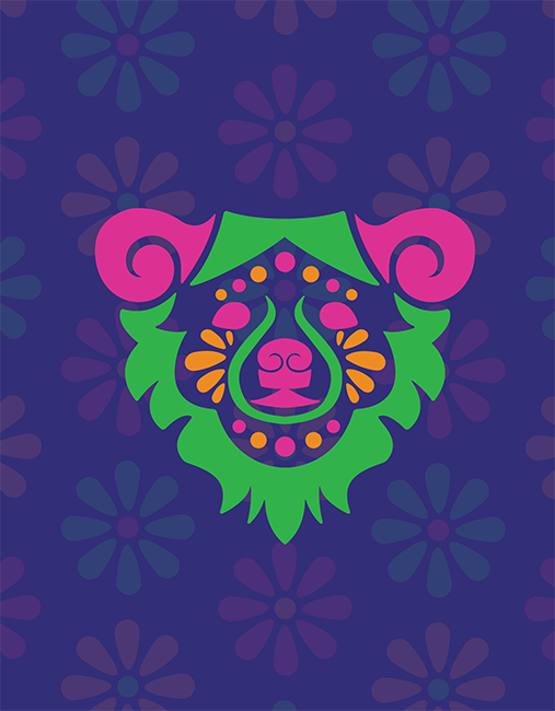
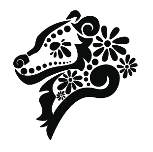
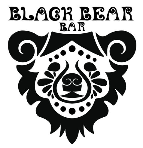
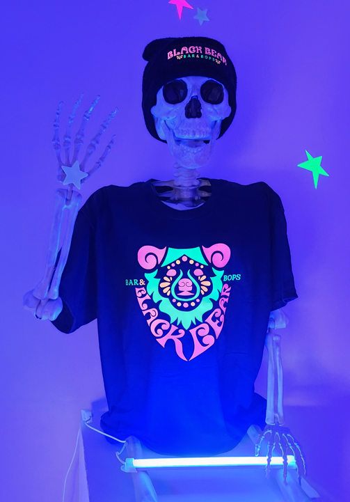
After further refinement, I landed on my final logo. Thumbnail 22 had grown and changed to incorporate hand lettering and a partner font in decoy. However, I could not stop thinking about the other hand lettered elements that I made earlier in the project based off of thumbnail 8. I decided to bring it back and made it a secondary logomark within the system. Luckily for me, blacklight colors are easy to choose. I picked bright, vibrant colors that would interact with fluorescent lights. Hot pink became my primary color, with green as a secondary and orange/dark purple as my tertiary colors. After some research, I discovered that I could purchase blacklight reactive vinyl, and so I utilized this to hand craft my own t-shirt and beanie using the created brand. Hand lettering made this project especially tricky. However, I learned to never throw away past ideas, as they may come in handy in future steps of the process.
Year: 2024
Art Director: Scott Gladd
Institution: Pennsylvania Western Edinboro University