When I first approached this project, I began as I always do: with a mind map. A black light bar could invoke many different feelings. The mind map made me realize that I wanted to create an inviting, kind atmosphere within a bar while still cultivating cool vibes. The thought of a dark space made me think about a bear den, and bears made me think about mother bears protecting their cubs. Thus, this thought process led me to decide to begin thumbnail exploration in the direction of bears. I originally considered the name "The Blacklight District." Then I shifted to focus on a bear name as the idea evolved.
My ideation explored psychedelic elements due to the blacklight aesthetic. In the 70s, the psychedelic design movement often used a variety of free-flowing lines, curves, and wacky shapes. Floral elements were often present as well, and art nouveau was a direct influence on the psychedelic style, too. I began to incorporate swirls and floral elements in to my ideation in order to pay homage to these styles.


After sketching my thumbnails, I decided to further explore 4, 8, and 22. I created digital roughs from these three designs, deciding to hand letter the type within 8 due to being unable to find a typeface that was appropriate to match the aesthetic I was aiming to achieve. While I liked 4's design, I ultimately decided to move forward with 22.
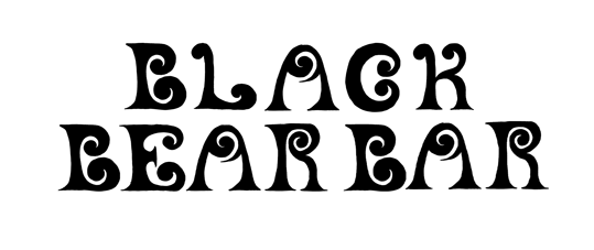
22 proved to be a challenge. At first I considered combining it with 8. However, the type competed too much. I quickly realized that working with type and this logo design would be a challenge. I had to craft type that would work as a piece of art itself and live alongside the logomark in harmony. This is where I decided to pursue hand lettering. Overall, I believe this was the correct decision. Much psychedelic art from the 70s was hand done, as technology was not a prevalent tool then. To properly pay homage to this aspect of design history, it only made sense that I borrowed methods from the masters!
With a more dominant hand-lettered display font, I needed to find a secondary typeface that would be unobtrusive while still matching the feeling I was attempting to achieve. I used thumbnail 8 as a jumping off point for exploring these secondary typefaces. Decoy became the typeface that matched the best, and I began to explore its arrangement with logo 22.
Incorporating hand lettering in to this project proved to be a challenge. However, by utilizing all of the elements from my previous brainstorming steps, I was able to craft a balanced logo that incorporated the fun blacklight psychedelic feeling that I was aiming to achieve.

Thumbnail 4
Thumbnail 8

Thumbnail 22

Thumbnail 22 and 8 Combined

Type explorations

Type Explorations

Secondary Type Explorations

Secondary Type Explorations with primary logomark
After further refinement, I landed on my final logo. However, I could not stop thinking about the other hand lettered elements that I made earlier in the project based off of thumbnail 8. I decided to bring it back and made it a secondary logomark within my system. Luckily for me, black light colors are easy to choose. I picked bright, vibrant colors that would interact with fluorescent lights. Hot pink became my primary color, with green as a secondary and orange/dark purple as my tertiary colors. After some research, I discovered that I could purchase black light reactive vinyl, and so I utilized this to hand craft my own t-shirt and beanie using the created brand.
Hand lettering made this project especially tricky. However, I learned to never throw away past ideas, as they may come in handy in future steps of the process.
Year: 2024
Art Director: Scott Gladd
Institution: Pennsylvania Western Edinboro


© Gwenyth Zeis-Miller 2025